On June 22, 2022, Carnival Corp. announced they would be transferring a ship from their Costa brand to the namesake Carnival Cruise Lines. It was announced that the Costa Venezia would go through a transformation that would see her renamed and relaunched as the Carnival Venezia. But unlike other Carnival Cruise Line’s ships, she would keep much of her Italian heritage, just adding the Carnival fun. To help cruisers understand that this ship would be a unique concept in the fleet (along with of her sister Costa Firenze / Carnival Firenze), Carnival introduced the tagline, “Costa by Carnival.”
On December 12, 2022, Carnival Cruise Lines announced further details and deck plans for the upcoming Carnival Venezia via a Facebook live session with President Christine Duffy. To help Carnival cruisers connect with this new ship, and understand how she will differ from the rest of her Vista-class sisters, we recorded a video that does a deck-by-deck plan comparison to fleet-favorite, Carnival Panorama.
It’s fascinating to see how Costa designed their Vista-Class of ships compared to how Carnival laid them out. Sailing all of the Carnival Vista-class ships (Carnival Vista, Carnival Horizon and Carnival Panorama) we were excited to map out the differences and share our findings in the video below.
Deck By Deck
With additional news released about this first “Fun, Italian Style” ship, we wanted to revisit the ship comparison with deck plan images and share the major differences from deck to deck.
As I begin to dig into the differences (and similarities), you’ll get a feel for how this ship compares to her Vista-class sisters. While the Italian flare found across the Carnival Venezia will certainly make her unique, there are many things she shares with her sisters – but there are also some big changes between these ships.
To better match the deck plans provided by Carnival Cruise Lines, I’ll start with Deck 1 and work my way up (in the video, we start at the top of the ship and work our way down).
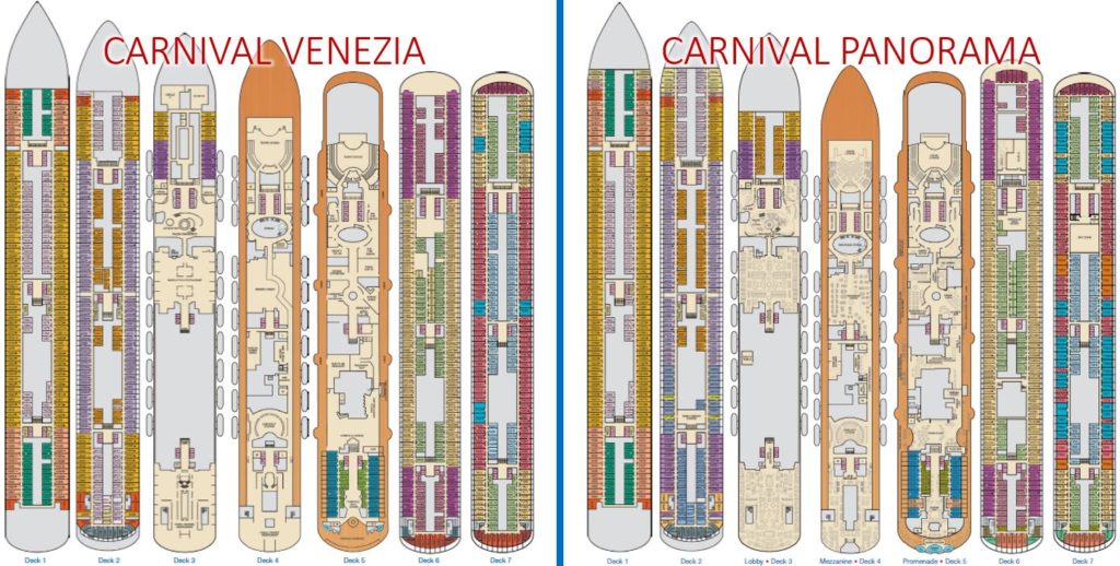
Decks 1-7

Deck 1

The main differences on Deck 1 between both ships is that Carnival Panorama has more rooms in the front of the ship. The forward hallways extend further into the bow.
Deck 2

Similar to Deck 1, Carnival Panorama has additional rooms in the bow the ship. Another difference is the lack of the Family Harbor section on the Carnival Venezia. Instead Venezia has a few additional staterooms where Family Harbor is located on Carnival Panorama (Aft Deck 2). The remainder of the Family Harbor rooms that exist on the Panorama still are there on Venezia, they’re just standard staterooms.
Deck 3

We start seeing some meaningful changes on Deck 3 at the front of Carnival Venezia with the addition of Circle C and Club O2 in this space that is otherwise blank on the Carnival Panorama. Immediately behind Circle C and Club O2 as you head aft on Venezia, you’ll see that there are no interior staterooms in the forward space. The reason for this is that this is where the karaoke lounge was located when the ship was operated by Costa. Carnival Panorama fills this forward space with additional interior staterooms.
Making our way into the atrium space, the layout is identical on both ships, however the Carnival Venezia boasts a San Marcos Square design with statues and large roman pillars, versus the LED funnels found on the Carnival Panorama.
Leaving the atrium, we find ourselves in the forward main dining room. Carnival Venezia’s layout is quite unique featuring several walls to break up the space, including the introduction of the Chef’s Table within the restaurant.
At the aft of Deck 3, the lower deck of the aft main dining room on Venezia features a Venice-style canal outfitted with a gondola in the center the of space. This is definitely a statement piece and the design is heavily themed to make it feel like you are in Venice. While Carnival Panorama’s dining room is modern with wood accents and clean lines, the Venezia certainly appears to win out in terms of theming and inspirational design.
Deck 4

Based on the pictures we’ve seen of the forward theater on the Carnival Venezia, it appears that there is fixed seating on the center floor, versus the movable seating that Liquid Lounge has on the Carnival Panorama. Moving aft from the theater, the first main change on Venezia is the addition of the Dream Studio just off of the atrium. Also in this space is a smaller, completely interior Cherry On Top. On the Panorama, we just see several Fun Shops located in this area.
Further back from the atrium, we encounter the Casino which has a similar layout. On the Venezia, near the aft of the casino there is a large Annex space. We’re still waiting on the announcement of how this will be used on the new ship. On Carnival Panorama, this is where Carnival Kitchens is situated. On the starboard side of the ship, we see Heroes Tribute Bar on both ships, followed by the Art Gallery on Venezia and Dreams Studio on Panorama.
The aft of the ship for both is very similar. You’ll encounter the Limelight Lounge before entering the upper level of the main dining room.
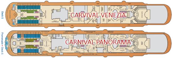
Deck 5


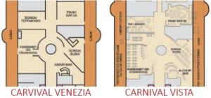
Hold on tight, because there are some big changes on this deck. While the theater at the forward of the deck is similar, we see lots of changes after that. Upon entering the atrium, we see the addition of a Salon on the Venezia versus where Cherry on Top sits on Panorama. Moving further back, there’s a complete reconfiguration of the space where Fahrenheit 555, Bonsai Sushi, and Piano Bar 88 are. In this case, Carnival Venezia is more similar to Carnival Vista, than the Carnival Panorama. The layout is very similar to the Vista, with the exception of Bonsai Teppanyaki taking the place of the Library. Gone is fleet-favorite Alchemy and instead we see Amari Bar, which is said to offer a familiar drink selection for Alchemy fans.
Aft of mid-ship on the Carnival Panorama has the Pixels gallery area, followed by Guy’s Pig & Anchor Smokehouse | Brewhouse. On the Carnival Venezia, there’s a large seating area for the new bar: Frizzante Bar. This bar is said to offer a large selection of bubble-inspired drinks. Heading further into the space (towards the port side of the ship), there’s a new Italian-style restaurant. This space hasn’t been finalized as of this writing and there is going to be an announcement made closer to the May launch date.
Continuing the tour towards the aft on Deck 5, we encounter a new space that is being introduced on the Venezia which isn’t present on Panorama: Estrada Grill. This space will serve up burgers with fixins and other familiar bites, all al fresco. Stepping back inside, we encounter Pixels on Carnival Venezia in the space where JavaBlue and Dreams Studio sits on Carnival Panorama and just beyond that area is Gondola Lounge on Venezia, which is a similar space to the Ocean Plaza on Panorama.
Finally reaching the back of the ship, we enter the Carnivale Bar & Lounge on the Venezia. It’s a space that celebrates the circus through bright colors and fun art work. On the Vista-class, Carnival used this space for the Havana bar with similarly categorized rooms. Carnival Venezia introduces a new class of rooms: Terrazza. The outdoor space is transformed with the absence of an infinity pool, and instead has stadium-style seating facing the wake with two hot tubs pulled up against the hotel tower, up and away from any wind. On Carnival Panorama, we see the pool flanked by two hot tubs looking over the aft of the ship.
Deck 6

At the forward of deck 6 on Carnival Venezia, there is an absence of forward-facing rooms (we love these forward-facing rooms on the Vista-class ships). As we move further aft, the Venezia has interior rooms in the space occupied by Circle C and Club O2 on Carnival Panorama. The large space that’s just aft of the forward elevator bank is taken up by the IMAX Theater or Sky Zone on Carnival’s Vista-class ships, but on the Venezia, we see additional interior rooms.
Continuing towards the back of the ship, we see a similar configuration between the two ships. The only minor difference is the Terrazzo rooms at the very aft of the ship on Venezia, versus the Havana rooms on the Panorama.
Deck 7

Carnival Venezia has about a dozen additional interior rooms on Deck 7 due to the absence of the Sky Zone facilities on Panorama. They have reconfigured several spaces throughout the deck to add in rooms.
Come back next week for the remaining decks as we continue to count up to the sky from sea level.

One thought on “Carnival Venezia vs Carnival Panorama: Part I”